Design System Theming and Tokens
RideFlag Technologies
I led an initiative to set up theming for new products for the RideFlag App design system. This required a design system audit, establishing a design token architecture, and checking for accessibility and consistency after dev handoff. I also created a new standardized color palette and their first component library.
Read Full Case Study
Research
Design System Audit
Design
Design System
Tokens
Themes
Tiimeline
2 Months
Internship
Tools
Figma
Product / Industry
B2C
Team
Individual
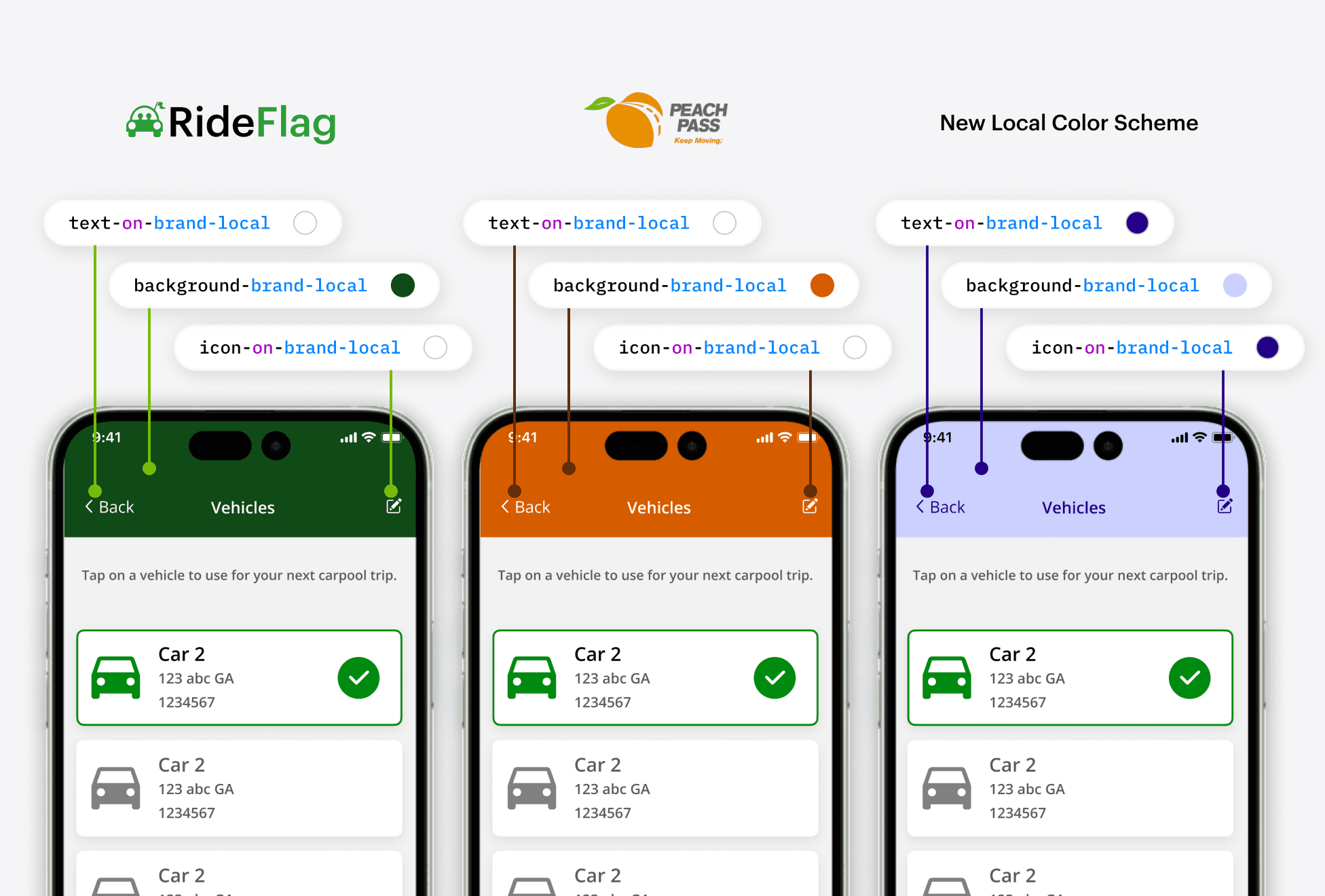
Facilitate transition to a themed colour system for while ensuring Consistency Across 70+ Screens and 4 Products?
4 Themes
After acquiring new clients, the RideFlag App - a carpool verification app - needed to be able to accommodate for regional branding colours of each transportation municipality.

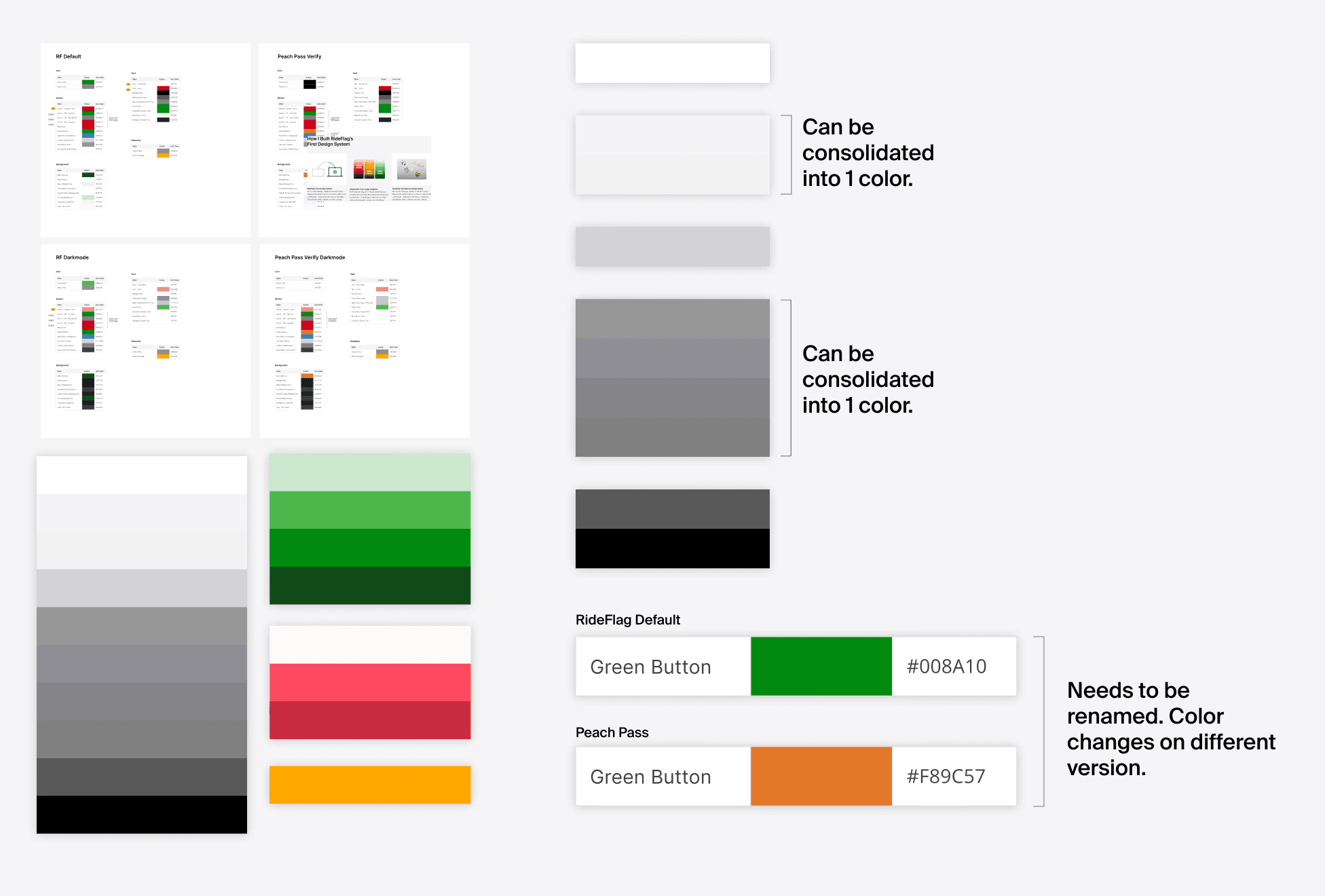
Color Style Audit
I conducted an audit to identify issues with overly similar colours, naming inconsistency, and general organization.
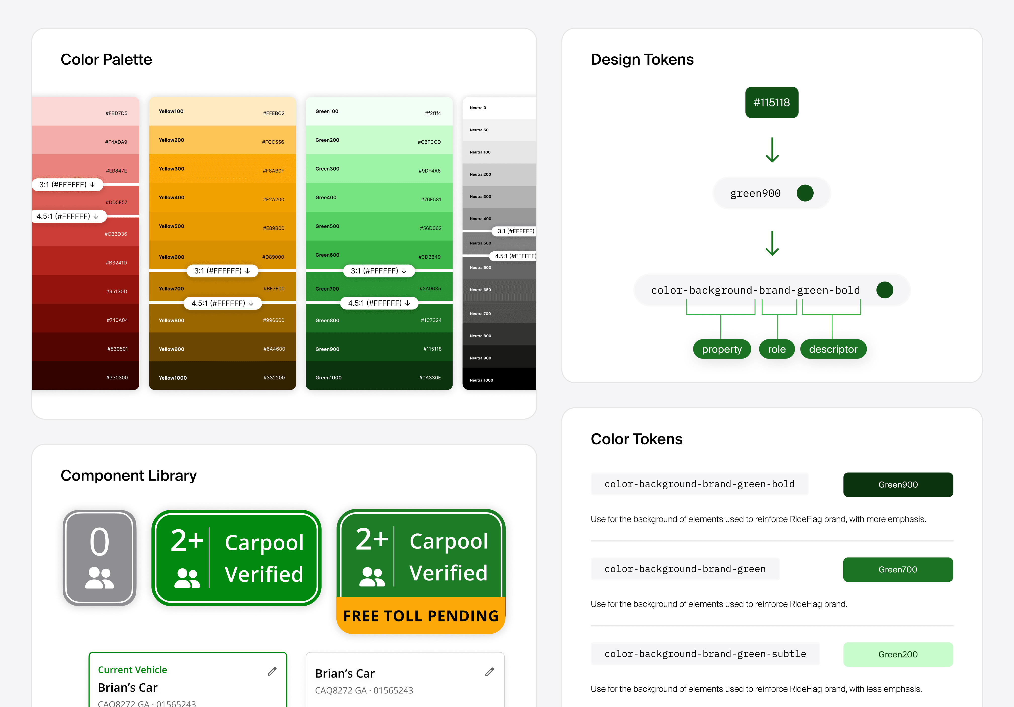
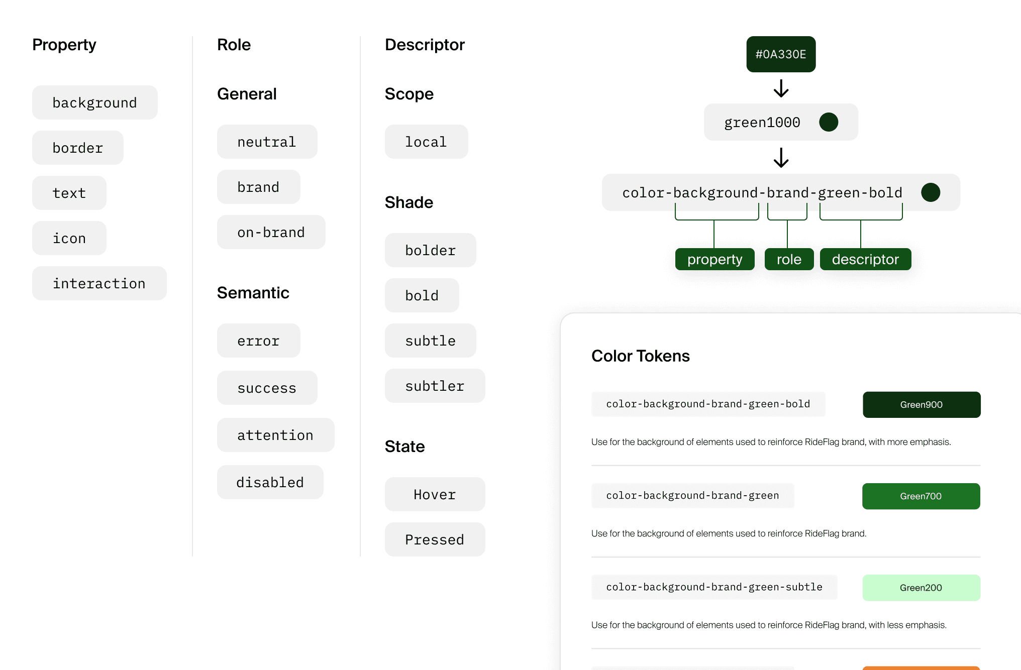
New Color Tokens While Keeping Design Intent
After the audit I redefined the core colours and established a standardized scaled colour palette. All new colours were tested on each screen to ensure adherence to accessibility standards and maintaining of design intent. Color scaling by hue, saturation, and brightness were all adjusted to be consistent.
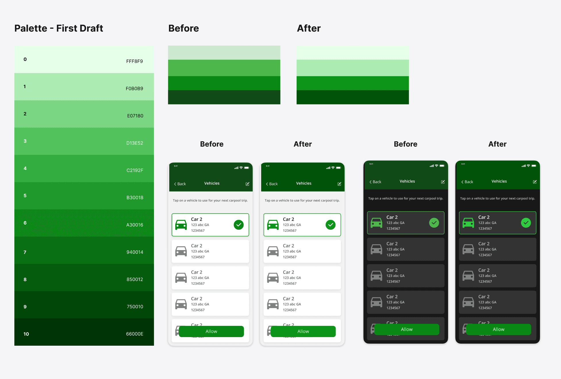
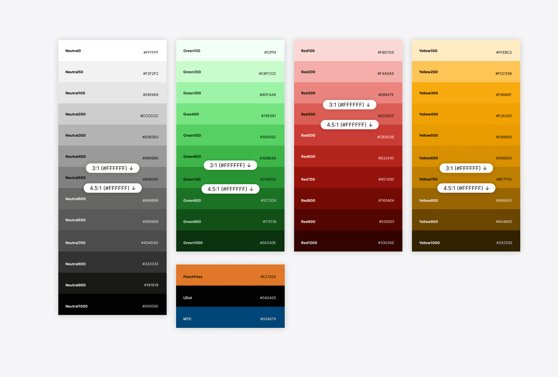
Finalized Colour Palette and Token Naming
A 10 shade colour palette (with more shades for neutrals) was established along with a token naming strategy tailored to adapt the frequent design changes and theming requirements of the app.
Future Developer Implementation
The work I did was not yet taken to the developer side to be adapted into React tokens and components. However I established a foundation for simplifying and organizing their colour tokens that will allow for future implementation.